 ultimate-guide
How to Choose Art for Your Living Room
Table of Contents
- Start With Your Room's Color Palette
- How to Choose Art Size for Your Wall
- Determine Your Eye Level and Placement
- Gallery Wall Layout Ideas and Composition
- Mix Art Styles, Mediums, and Frames
- How to Make Your Living Room Look Expensive
- Original Art vs. Prints and Budget Strategies
- Maintain and Preserve Your Art Collection
Last Updated: August 22, 2026
Start With Your Room's Color Palette
When you choose art for living room spaces, the color palette is your foundation. Before you buy a single print or canvas, examine your existing furniture, wall color, and lighting conditions.
The relationship between your art and your room's colors determines whether pieces feel cohesive or scattered. Your art should either complement existing colors or introduce a new accent color that feels intentional. Many designers recommend choosing art that pulls colors from at least two places in your room, if your sofa is gray and throw pillows are mustard yellow, look for art incorporating both tones plus a neutral or complementary color.
Warm tones (oranges, reds, warm yellows) create energy and intimacy. Cool tones (blues, greens, purples) promote calm and relaxation. Choose based on your room's purpose: warm tones for entertaining spaces, cooler palettes for quiet retreats.
Lighting changes everything. Natural daylight reveals different colors than evening lamp light. Spend time in your room at different times of day before committing to art.
How to Choose Art Size for Your Wall
Getting scale and proportion right is critical. For a single large statement piece above a sofa, the art should be roughly 50-75% of the sofa's width (asid.org). If your sofa is 84 inches wide, aim for a piece between 42 and 63 inches wide.
Above a console table, the art should be about 75-90% of the table's width. Above a bed, apply the same principle: the art should be narrower than the bed frame. These proportions create the sense that the art belongs with the furniture below it.
For gallery wall arrangements, cover between 40-60% of the wall space. This leaves breathing room that makes the arrangement feel curated rather than cluttered.
Hang art so the center point is at eye level, typically 57-60 inches from the floor (the American Academy of Dermatology). Maintain 8-12 inches of space between the top of furniture and the bottom of the frame.
When combining multiple pieces, vary sizes intentionally. Aim for a 60-30-10 distribution: 60% of pieces in one size range, 30% in a smaller size, and 10% in a very small or very large size.
Determine Your Eye Level and Placement
The center of your art should sit at 57-60 inches from the floor, the natural height of a standing person's gaze. This rule applies to single pieces, gallery walls, and grouped arrangements.
Placement relative to your focal point matters equally. In most living rooms, the focal point is the sofa, fireplace, or a large window. Your art should either enhance that focal point or create a secondary point of visual interest.
For walls with multiple windows or architectural features, position your art to complement rather than compete. A wall with a large window is already a focal point; art here should be secondary or absent entirely.
When hanging art above a console or side table, ensure the piece is centered horizontally above the furniture. Asymmetrical placement looks accidental rather than intentional.
Gallery Wall Layout Ideas and Composition
A gallery wall transforms a blank space into a curated statement. Plan before you hang anything by laying everything out on the floor first.
Start with your largest piece as the anchor. From there, build your arrangement outward. Alternate between vertical and horizontal pieces to create visual rhythm. Avoid perfect grids; asymmetrical arrangements feel more intentional and modern.
Tight spacing (2-3 inches) creates a cohesive, gallery-like aesthetic. Loose spacing (6-8 inches) gives each piece breathing room. Consistent spacing throughout creates order; varying spacing creates visual interest.
Mix mediums and frame styles intentionally. Combining matted prints, canvas, wood frames, and metal frames creates texture and sophistication. Maintain visual coherence through color, the overall palette should feel connected.
Consider weight distribution. Heavy, dark pieces should be balanced across the wall rather than clustered on one side. Place your largest or darkest piece off-center, then balance it with medium-sized pieces on the other side.
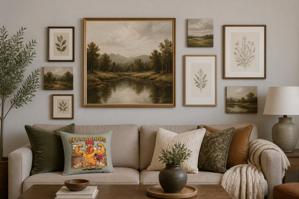
For asymmetrical gallery walls, start with your anchor piece slightly off-center. Group pieces in odd numbers (three, five, seven), which creates visual interest that even numbers don't.
Mix Art Styles, Mediums, and Frames
Mixing styles creates personality. The trick is creating coherence across different styles through color, scale, and frame consistency. You might pair a modern abstract print with a classical landscape and contemporary photography, but if they share similar frames and a color palette, they feel intentional.
Using the same frame style across different art pieces creates unity. Black frames unify eclectic pieces. Natural wood frames create warmth and cohesion. Matted prints with consistent mat colors tie disparate pieces together.
Canvas versus framed prints creates visual texture. Mixing both creates dimension. Canvas works well for larger statement pieces; framed prints work well for gallery walls and smaller groupings.
Original artwork versus prints is a practical decision rooted in budget and authenticity. Many sophisticated living rooms blend both, an original painting as the focal point, surrounded by carefully selected prints.
Abstract versus representational art determines mood. Abstract pieces create energy and conversation. Representational art (landscapes, portraits, still life) creates familiarity and calm. Mixing both prevents the room from feeling too busy or too static.
Texture in art adds depth. Mixed media pieces, textured canvas, and three-dimensional wall art create visual interest when paired with flat prints.
How to Make Your Living Room Look Expensive
Expensive-looking rooms share specific characteristics in how they display art. The first is intentionality, every piece has a reason for being there.
Expensive spaces use negative space strategically. Rather than filling every wall, they leave breathing room. A single large statement piece on a blank wall reads as more luxurious than a crowded gallery wall.
The quality of framing elevates everything. High-quality frames signal investment. Matting transforms prints into gallery-quality pieces. A simple print in museum-quality matting and framing looks exponentially more expensive than the same print in a thin plastic frame.
Lighting dramatically affects perceived value. Art displayed with proper lighting looks intentional and expensive. Consider how light falls on your pieces at different times of day.
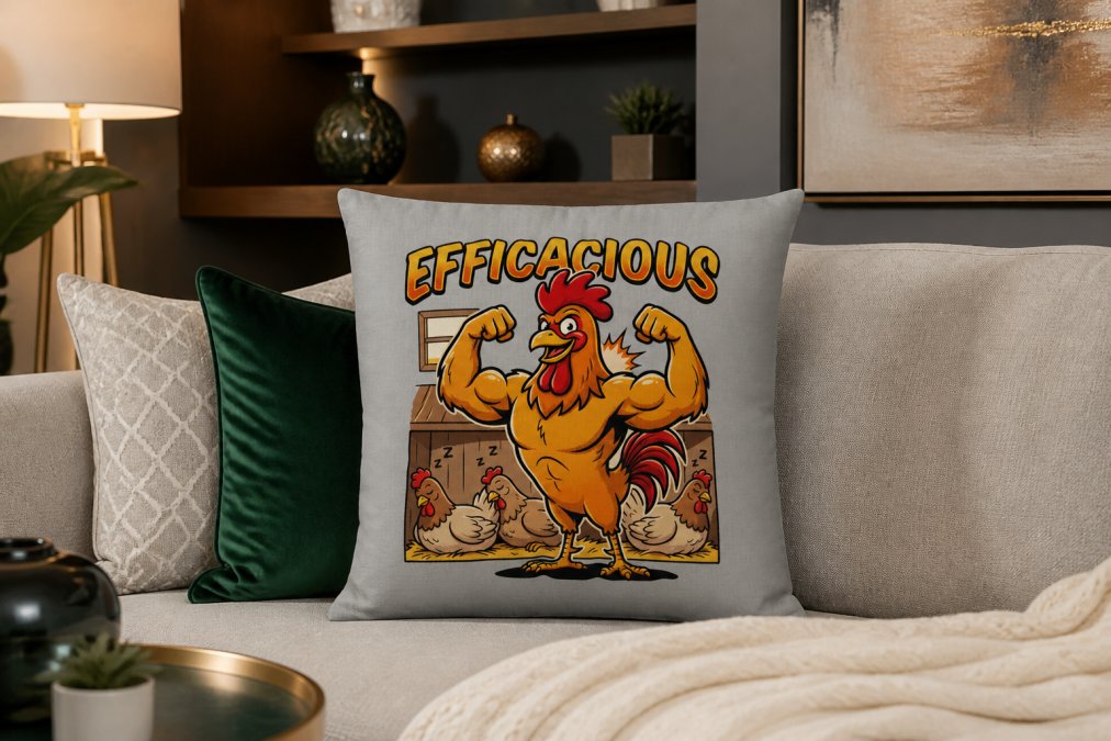
Color sophistication matters. Expensive-looking rooms use restrained color palettes, typically two to three main colors plus neutrals. Limiting your palette creates cohesion and sophistication.
The relationship between art and furniture proportion signals quality. When art, furniture, and accessories are properly scaled to each other, the room feels intentional.

Statement pieces anchor expensive-looking rooms. Rather than spreading your budget across many small pieces, invest in one or two significant focal point pieces.
Original Art vs. Prints and Budget Strategies
The choice between original art and prints is fundamentally about budget, authenticity, and maintenance. Original artwork carries uniqueness and investment value. Prints offer flexibility and affordability. Most living rooms benefit from a mix.
Original artwork appreciates over time and carries emotional significance. Fine art prints, museum-quality reproductions, bridge the gap between originals and mass-produced prints. They're printed on archival paper with archival inks, often with matting and framing that rivals original presentation.
Budget-friendly sourcing requires strategy. Develop a curatorial vision first, knowing your color palette, style preferences, and specific spaces you're filling. Online marketplaces like Etsy feature independent artists. Instagram connects you directly with creators. Local art fairs and gallery shows support artists while offering unique pieces at various price points. Caltucky Creations offers curated home decor pieces that work beautifully as part of a gallery wall or alongside other art, their fresh designs and stylish approach to home essentials make them an excellent resource for creating a cohesive aesthetic without overspending.

Thrift stores and estate sales provide unexpected treasures at prices far below retail. Rotating art seasonally keeps your space feeling fresh without constant investment.
Invest in quality framing and matting, a $20 print in a $100 frame looks far more expensive than a $50 print in a cheap frame.
When budgeting, prioritize one statement piece rather than many mediocre ones. Build around it with more affordable prints and accessories. Mixing mediums stretches your budget: canvas prints cost less than original paintings, framed prints cost less than canvas, unframed art costs less than framed.
For pieces you plan to keep long-term, archival quality justifies the investment. Professional framing ensures proper preservation and presentation.
Maintain and Preserve Your Art Collection
Proper maintenance ensures your art remains beautiful and valuable. Canvas and oil paintings need protection from direct sunlight, which fades colors over time (si.edu). Prints, especially archival ones, last longest when kept away from UV light and moisture.
Dust artwork regularly using soft, dry cloths. Never use water or cleaning solutions on original paintings or valuable prints.
Temperature and humidity stability preserve art. Extreme fluctuations cause paint cracking, paper warping, and frame deterioration. Keep your living room at consistent levels.
Framing protects art from environmental damage. UV-protective glass filters harmful light. Acid-free matting prevents deterioration of paper.
Inspect framed art periodically for signs of damage, discoloration, mold, or shifting. Store art flat or vertically in climate-controlled spaces. Wrap framed pieces in acid-free paper.
Insurance protects valuable pieces. Document your collection with photos and valuations. For expensive original artwork, maintain appraisals for insurance purposes.
Choosing art for your living room is a process of intentional curation. Start with your color palette and room's proportions. Build from a strong focal point, whether that's a single statement piece or a carefully arranged gallery wall. Mix styles and mediums thoughtfully, using frames and matting to create cohesion. Invest in quality where it matters, framing, lighting, and one or two anchor pieces, while using affordable options like prints and pieces from Caltucky Creations to fill in thoughtfully. The result isn't about having the most expensive art; it's about creating a space that reflects your aesthetic and feels intentionally designed. The best art for your living room is the work that makes you happy every time you see it.
Frequently Asked Questions
What is the 60-30-10 rule for decorating living rooms?
The 60-30-10 rule guides color balance in your space: 60% is your dominant color (usually walls or large furniture), 30% is a secondary color (accent pieces like throw pillows or artwork), and 10% is an accent color (statement art or decorative accents). Apply this rule when choosing art by selecting pieces that complement your existing 60% and 30% colors, using art as your 10% pop. This creates visual harmony and prevents your living room from feeling chaotic or overwhelming.
How do I choose art size for a wall above my sofa?
Art should cover 50-75% of your wall space width. For a standard sofa (72-84 inches wide), hang a single piece 36-48 inches wide or create a gallery with combined width in that range. The bottom of the frame should sit 8-10 inches above furniture. If your wall feels empty, go larger, undersized art makes rooms feel disconnected. Use painter's tape to outline your planned size before committing, ensuring the scale balances your furniture and room proportions.
What is the 2/3 rule for living room wall art?
The 2/3 rule states that art should occupy roughly two-thirds of the wall space above your furniture to create proper visual weight and balance. This prevents art from appearing lost on a large wall or overwhelming a small space. For example, if your wall is 120 inches wide, your art arrangement should span approximately 80 inches. This proportion works across different room sizes and furniture arrangements, making it a reliable guide for achieving cohesion in your living room.
Can I mix different art styles in one living room?
Yes, mixing art styles creates visual interest and reflects your personality. The key is establishing a unifying element: a consistent color palette, matching frame style, or similar matting. For instance, pair abstract art with botanical prints using black frames and white matting. Vary mediums (canvas, prints, mixed media) but keep the overall aesthetic cohesive through these connecting threads. This approach prevents your living room from feeling disjointed while celebrating diverse artistic expression.
This article was written using GrandRanker