 how-to
How to Choose Art for Small Walls: A 2026 Guide
Table of Contents
- Understanding Scale and Proportion for Small Walls
- Best Art Sizes for Small Apartments
- How to Create a Gallery Wall in a Small Space
- How to Hang Art Correctly on Small Walls
- Choosing Art That Works with Your Existing Furniture
- Frame Style and Matting to Enhance Perceived Size
- Lighting and Placement Tips for Maximum Impact
- Conclusion
Last Updated: August 23, 2026
Understanding Scale and Proportion for Small Walls
When you're learning how to choose art for small walls, the first principle is understanding that scale and proportion aren't just design concepts, they're the foundation of whether a piece will work in your space or feel awkward and out of place. A painting that looks stunning in a gallery with 20-foot ceilings can overwhelm a bedroom corner. Conversely, a tiny frame on a large empty wall creates visual imbalance that pulls your eye nowhere.
The key is matching the proportions of your art to the proportions of the wall itself. A common mistake is treating a small wall as a constraint rather than an opportunity. Small walls demand intention. They force you to be deliberate about what you hang, which often results in stronger, more curated spaces than larger walls that get filled with whatever fits.
Visual weight matters here. A single large, bold piece can anchor a small wall more effectively than three small, timid ones. Think about negative space, the empty area around your art. On small walls, negative space isn't wasted space. It's breathing room that makes your chosen piece feel intentional rather than like an afterthought.
According to interior design principles from the American Society of Interior Designers, the rule of thumb is that your art should occupy between 50-75% of the wall space you're working with. On a small wall, this means being more aggressive with your selection. If your wall is 3 feet wide, you're not looking for a 12-inch frame. You're looking for something that commands attention.
Best Art Sizes for Small Apartments
The best art sizes for small apartments depend on the specific wall dimensions and the furniture beneath or beside the piece. Standard frame sizes, 8x10, 11x14, 16x20, are manufactured because they work in typical homes. But small apartments often have atypical walls, which means standard sizes might not be your answer.
For a small bedroom wall above a nightstand, an 8x10 or 11x14 frame works well. These sizes feel present without overwhelming the intimacy of the space. If you're hanging art in a narrow hallway, consider vertical orientation, taller and narrower pieces create the illusion of height and draw the eye upward, making the space feel less cramped.
In living rooms with limited wall real estate, a single 20x24 or 24x36 piece often outperforms a cluster of smaller frames. The focal point is clear, the composition is strong, and you're not fragmenting the wall with multiple frames competing for attention. This is where gallery walls can backfire in small spaces, too many pieces create visual clutter rather than curation.
The frame itself affects perceived size. A thick, dark frame makes art appear larger and heavier. A thin, light frame makes it feel smaller and more delicate. If you're working with a small wall and want the art to feel substantial, choose a frame with visual weight. If you want to maximize the sense of open space, go minimal on the frame.
Caltucky Creations offers thoughtfully designed home decor pieces that work well in compact spaces. Their selection includes items that anchor small walls without overwhelming them, making it easier to find pieces that actually fit your dimensions rather than forcing standard sizes into non-standard spaces.
How to Create a Gallery Wall in a Small Space
Creating how to create a gallery wall in a small space requires a different strategy than gallery walls in larger rooms. The temptation is to go minimal, maybe just three small frames. But a well-executed gallery wall in a small space actually creates more visual interest and intentionality than a single lonely piece.
The secret is planning before you hang anything. Lay all your frames on the floor first, arranged in the pattern you want to hang them. This takes 10 minutes and saves you from drilling holes in the wrong places. Measure the total dimensions of your arrangement, then measure your wall. Your gallery wall should occupy no more than 75% of the wall space, leave room for breathing.
Consistency matters in small spaces. A gallery wall with wildly mismatched frames can feel chaotic when space is tight. Choose frames in two colors maximum (black and natural wood, or white and brass), or go all matching. This creates visual cohesion that makes the space feel intentional rather than haphazard.
Vertical alignment is your friend. Rather than a scattered, organic layout, consider a grid or linear arrangement. Horizontal spacing of 2-3 inches between frames looks deliberate. Vertical stacking of frames creates height, which makes small rooms feel less cramped. Asymmetrical arrangements work, but they require more careful planning in confined spaces.
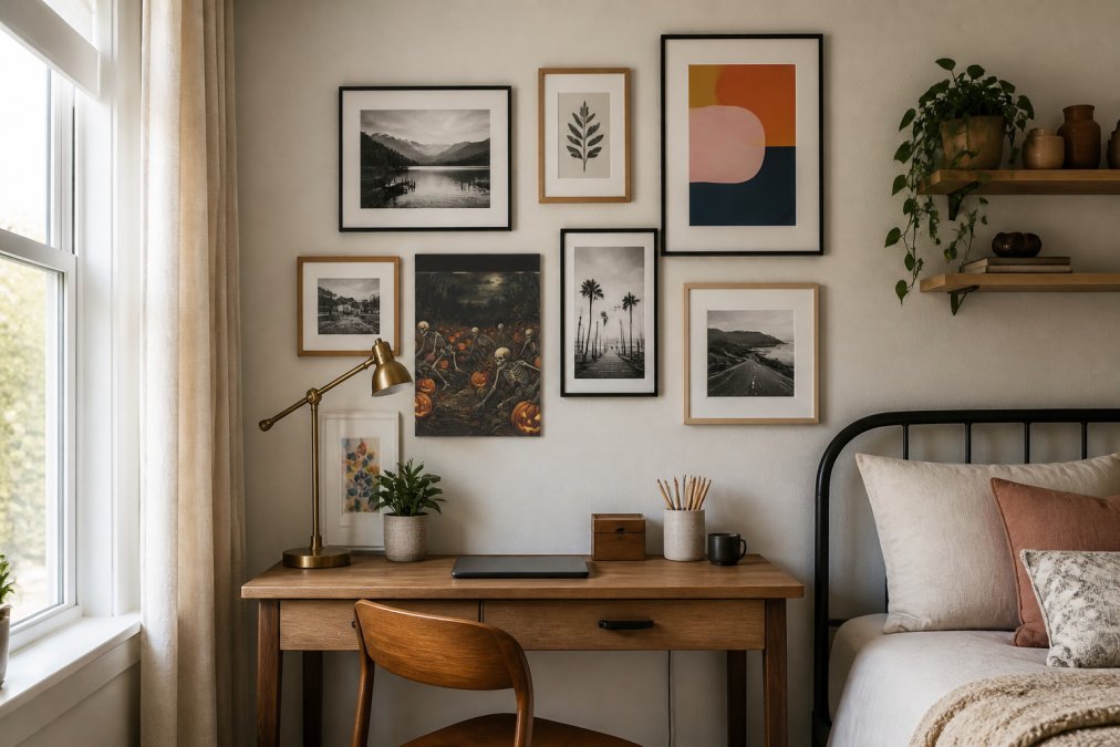
The proportions of your overall gallery wall to the wall itself matter as much as the individual pieces. If your wall is 4 feet wide, your gallery wall should be no wider than 3 feet. This leaves substantial negative space on either side, which prevents the arrangement from feeling cramped or overwhelming. Think of the gallery wall as a single visual object, not a collection of separate pieces.
How to Hang Art Correctly on Small Walls
Hanging art correctly on small walls starts with one rule: eye level. The center of your art should be 57-60 inches from the floor (aia.org). This is where the average person's eyes naturally rest, and it's the most comfortable viewing height. On small walls, this rule becomes even more critical because there's less room for error.
Use a level. Seriously. A crooked frame is the fastest way to make a space feel careless. A $10 level takes 30 seconds to use and eliminates the second-guessing. Mark your nail holes lightly with pencil first, step back, look at it from across the room, then commit.
For small walls, mounting hardware matters. If you're renting, adhesive strips work for lighter frames. For heavier pieces, you need proper wall anchors. Toggle bolts hold weight better than plastic anchors. If you're hanging multiple pieces in a gallery wall, use the same hardware throughout, mixing mounting methods creates visual inconsistency that's more noticeable in tight spaces.
The distance between your art and furniture is important. If you're hanging a piece above a sofa, desk, or bed, maintain 8-12 inches of space. This gap creates visual separation that prevents the furniture and art from feeling like they're competing for attention. On small walls, this spacing is what prevents the room from feeling cluttered.
Choosing Art That Works with Your Existing Furniture
The relationship between your art and your furniture is what separates a curated space from a random collection. Your art should either complement your furniture or intentionally contrast with it, but it shouldn't ignore it.
If your furniture is modern and minimal, choose art with clean lines and simple frames. If your furniture is eclectic and colorful, your art can be more adventurous. The key is visual harmony. This doesn't mean everything matches, it means the pieces speak the same visual language.
Consider the color palette of your furniture. If your sofa is warm gray, art with warm undertones (earth tones, warm blacks, warm whites) will feel cohesive. If your furniture is cool-toned, cooler art (blues, cool grays, cool whites) creates visual continuity. This is where many people go wrong: they choose art they love in isolation, then realize it clashes with everything else in the room.
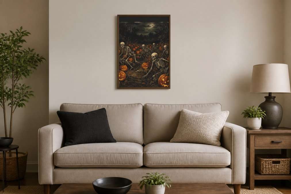
Your art should also anchor your furniture. In a small space, a piece of art hung above a sofa, bed, or console table creates a focal point that ties the furniture to the wall. This prevents the furniture from feeling like it's floating in the middle of the room. The art becomes the visual anchor that says "this is the center of this space."
Size relationships matter. If your sofa is small, your art should be proportional. A massive abstract canvas above a loveseat will overwhelm it. A modest-sized piece will feel intentional. This is where understanding scale becomes practical: your art should be large enough to matter but not so large that it dominates the furniture it's meant to complement.
Frame Style and Matting to Enhance Perceived Size
Your frame choice directly affects how large your art appears. This is one of the most overlooked factors when learning how to choose art for small walls. A thin frame makes art feel smaller and more delicate. A thick, substantial frame makes it feel larger and more commanding. On small walls, frame choice is strategic.
Matting serves a similar function. A wide mat creates distance between the image and the frame, which makes the overall piece feel larger. A narrow mat or no mat makes the piece feel more compact. If you're working with a small wall and want your art to feel substantial, add matting. If you want to maximize the sense of minimalism, skip it.
Dark frames absorb light and recede visually, making the art feel more prominent. Light frames reflect light and compete with the art for attention. On small walls, dark frames often work better because they put the focus on the art rather than on the frame itself. This is why black frames are so popular in small spaces, they disappear visually and let the art shine.
Wood frames add warmth and organic texture. Metal frames feel contemporary and clean. On small walls, consistency matters. If you're mixing wood and metal, do it intentionally, perhaps wood frames for photography and metal frames for prints. Random mixing creates visual noise that's more noticeable in confined spaces.
The finish of your frame matters too. Matte finishes feel softer and more subtle. Glossy finishes reflect light and feel more formal. In small bedrooms or intimate spaces, matte finishes often feel more appropriate. In living rooms or entryways, glossy finishes can add a bit of visual interest.
Lighting and Placement Tips for Maximum Impact
Lighting transforms how your art appears on small walls. A well-lit piece looks vibrant and intentional. A poorly lit piece looks dim and forgotten. If you're serious about making your art work in a small space, lighting is non-negotiable.
Natural light is ideal, but it's inconsistent. If your small wall gets morning sun, your art will look different in the morning than in the evening. Consider this when choosing your piece. Cool-toned art can look washed out in bright morning light. Warm-toned art can feel muddy in soft evening light. If your wall gets mixed natural light throughout the day, choose art that works across different lighting conditions.
Accent lighting, a small picture light above the frame or a track light aimed at the piece, transforms the impact. These lights are inexpensive and create a gallery-like effect that makes even modest art feel curated and intentional. In small spaces, this professional touch makes a huge difference in how the space feels.
Placement on the wall matters as much as the lighting. Art placed at eye level and centered on a wall feels balanced. Art placed off-center or higher up creates intentional asymmetry that can make a space feel more dynamic. On small walls, off-center placement can actually make the space feel larger because it breaks the predictability.
Avoid placing art in direct sunlight if possible. UV light fades prints and photographs over time. If your small wall is in a sunny spot, consider UV-protective glass or plexiglass for your frame. This adds cost, but it preserves your art.
The wall color behind your art affects how the piece reads. A white wall makes art pop. A colored wall can either complement or clash with your art. On small walls, this decision is more critical because the wall is more visible around the frame. If your wall is a deep color, light-framed art will stand out more. If your wall is light, dark frames will command attention.
According to lighting design guidelines from the Illuminating Engineering Society, artwork benefits from lighting that's 3-5 times brighter than ambient room light. This creates visual hierarchy that draws the eye to your art. In small spaces, this focused lighting makes the art feel like the intentional focal point rather than just something on the wall.
Conclusion
Choosing art for small walls isn't about finding pieces that fit. It's about being intentional with scale, proportion, and placement so that every piece feels like it belongs.
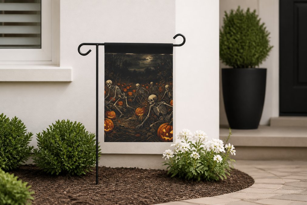
Start with Caltucky Creations' curated collection of home decor pieces designed for spaces exactly like yours. For example, our Halloween Skeleton Pumpkin Garden Flag or the Halloween Scarecrow Garden Flag can add a unique flair to your outdoor space, even if it's compact. Browse our catalog, measure your walls, and choose pieces that feel intentional rather than like they're just filling empty space.


The difference between a small space that feels cramped and one that feels intentional comes down to the art on your walls. Get started with Caltucky Creations and transform your small walls into focal points that define your space.
| Strategy | Best For | Visual Impact |
|---|---|---|
| Single large piece | Focal wall, statement making | Bold, commanding |
| Gallery wall (3-5 pieces) | Creating visual interest | Curated, intentional |
| Vertical stacking | Narrow walls, height illusion | Dynamic, upward draw |
| Asymmetrical placement | Contemporary, energetic feel | Modern, balanced |
| Matted frames | Adding perceived size | Sophisticated, spacious |
| Dark frames | Minimalist spaces | Art-focused, clean |
Frequently Asked Questions
Q: What is the 2/3 rule for wall art?
A: The 2/3 rule suggests that art should cover approximately two-thirds of the wall space above your furniture anchor (like a sofa or desk). For small walls, this means choosing appropriately scaled pieces that don't overwhelm the room or leave it feeling sparse. This creates visual balance and prevents your art from looking lost on the wall.
Q: How do you arrange art on a small wall?
A: Arrange art on small walls by starting with a focal point at eye level (57-60 inches from the floor). Leave consistent spacing between pieces, typically 2-3 inches. Use the gallery wall method with symmetrical or asymmetrical layouts depending on your style. Measure and mark positions with painter's tape before hanging to avoid mistakes and ensure intentional placement.
Q: Can you put large art on a small wall?
A: Yes, but strategically. A single large statement piece can work on a small wall if it's your focal point and you leave ample negative space around it. Avoid multiple large pieces, which create clutter. The key is proportion: if your wall is 3 feet wide, a 24-30 inch piece works; anything larger will dominate the space and feel cramped.
Q: Should art be centered on a small wall?
A: Centering works well on small walls when you have one focal point, but it's not your only option. Asymmetrical arrangements and off-center placement create visual interest and can make tight spaces feel intentional rather than cramped. The most important factor is eye level alignment, most art should be centered at 57-60 inches from the floor for comfortable viewing.
This article was written using GrandRanker